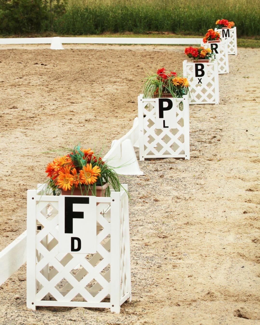
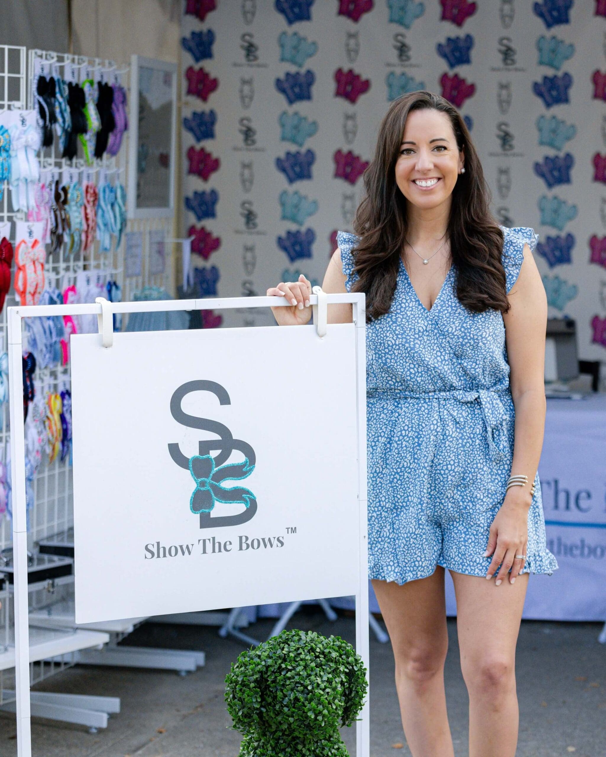
When you think about successful horse businesses—those trainers with full barns, tack shops that feel like a destination, or equine bodyworkers booked out months in advance—there’s a good chance they all have one thing in common: visual consistency.
It’s not just about looking pretty. Visual consistency is about building recognition, creating trust, and making every touchpoint feel like part of a bigger, more professional whole. In the equestrian world, where word-of-mouth still reigns supreme but digital presence is essential, your visuals do a lot of the heavy lifting when you’re not there to speak for yourself.
Let’s break down what visual consistency actually means, why it matters, and how you can tighten yours up—whether you’re DIYing or working with a designer.
What Is Visual Consistency?
Visual consistency means that your brand looks and feels the same across every platform, product, and piece of communication. That includes:
- Your logo and how it’s used
- Fonts and typography
- Colors (and how they’re applied)
- Photo style and editing
- Layouts, spacing, and design rules
- Social media graphics and templates
- Website elements
In short: anything visual that represents your business should follow the same style guidelines. This isn’t about rigid rules—it’s about creating a recognizable identity people can trust.
Why It Builds Trust
Imagine someone lands on your Instagram. They click through to your website. Then they see a flyer at a local tack shop. If all three look like they could belong to totally different businesses, it creates confusion—and hesitation.
But if everything looks cohesive? They feel confident. They understand your brand. And they’re more likely to take the next step. Here’s why that matters:
- Familiarity breeds trust. We’re hardwired to trust what feels familiar. When your visuals are consistent, you start to build recognition—and recognition leads to trust.
- Clarity sells. A clear, unified message helps potential clients understand what you do and what makes you different. That clarity reduces friction when someone’s deciding whether to reach out or book.
- You look more established. Even if you’re just starting out, consistency gives the impression that you’re serious, experienced, and ready to be taken seriously. That’s a huge deal in industries that rely on personal recommendations.
Real-World Example
Let’s say you’re an equine massage therapist. You’ve got a great logo, but your Instagram uses three different font styles. Your website header is in bright turquoise, but your business cards are navy blue. And your Facebook cover photo? A blurry image from a clinic three years ago.
None of these things are dealbreakers alone—but together, they muddy the waters. A potential client may pause and wonder: is this a side hustle or a serious service?
Now flip the script.
You’ve got a logo used consistently across platforms. Your colors are soft neutrals with a pop of green. Every post on Instagram uses a matching font and similar photo editing. Your website and print flyers feel like they’re cut from the same cloth.
That’s visual consistency. It tells a story. It builds trust. And it helps you stand out—without shouting.
How to Audit Your Visuals
Grab a notebook or open a new doc and take a look at your business through a fresh lens. Here are a few places to start:
- Logo Use
- Are you using the same version of your logo across platforms?
- Do you have variations (horizontal, stacked, icon-only) for different spaces?
- Colors and Fonts
- Are you using the same colors everywhere? Or are things looking a little rainbow?
- Do you know your brand fonts—and are you using them consistently?
- Photography
- Do your images have a cohesive vibe?
- Are they well-lit, clear, and styled to match your aesthetic?
- Social Media Templates
- Are your post graphics using a consistent layout, font, and color palette?
- Does your grid feel polished and intentional?
- Print Materials
- Do your business cards, brochures, signage, and packaging match your online presence?
This kind of audit doesn’t need to be overwhelming. Start by identifying two or three areas where things feel mismatched and focus there.
Tools to Help You Stay Consistent
You don’t need to reinvent the wheel every time you post or design something. A few tools can make it easier to stay on-brand, even when you’re short on time.
- Brand Guidelines: Create a simple brand guide that outlines your colors (with hex codes), fonts, logo rules, and a few image examples.
- Canva Pro: Set your brand colors and fonts so they’re always at your fingertips. Save templates for recurring posts like testimonials or promotions.
- Google Drive Folder: Keep your logos, photos, and design assets in one easy-to-find place.
- Scheduling Platforms: Tools like Later or Planoly help you see your grid in advance and spot inconsistencies.
When to DIY vs. Hire Help
If your budget is tight, start small. Pick a few visual elements (like your logo and colors) and build out from there. But if your brand is growing and you’re serious about taking things to the next level, professional design is worth the investment. A designer can build a full visual identity and give you templates that make consistency feel effortless.
At Mare Media, we specialize in semi-custom templates and full-service branding tailored for horse pros. Whether you’re starting fresh or need a polish, we make it easy to get visuals that compete—and convert.
Final Thoughts
Visual consistency isn’t just a design decision. It’s a business decision. It signals that you’re intentional, trustworthy, and professional—and that goes a long way in a saturated market. When your brand shows up the same way across every platform, you become memorable. And memorable brands are the ones people recommend, follow, and come back to.
So if your visuals have been all over the map, consider this your sign. Choose your colors. Pick your fonts. Clean up that Canva folder. Then show up—again and again—the same way you want to be remembered.
Because consistency isn’t boring. It’s what makes your brand feel like home.


Comments +